How to read candlestick charts
Candlestick charts are among the most popular style of charts and widely used by today's traders. Dating back to the early 18th century, the candlestick notation was developed by Japanese rice merchants who would use their accumulated knowledge to make predictions about the commodity's price. Candle charts are not the only type of chart available to traders. They’re one of many graphical representations of price action, which have developed alongside the markets.
Line charts
The simplest form of a chart that traders routinely plot is called a line chart. That’s precisely what it sounds like: a series of individual price points or prints recorded and joined together by a line that connects all the points or prints made during an observation period.
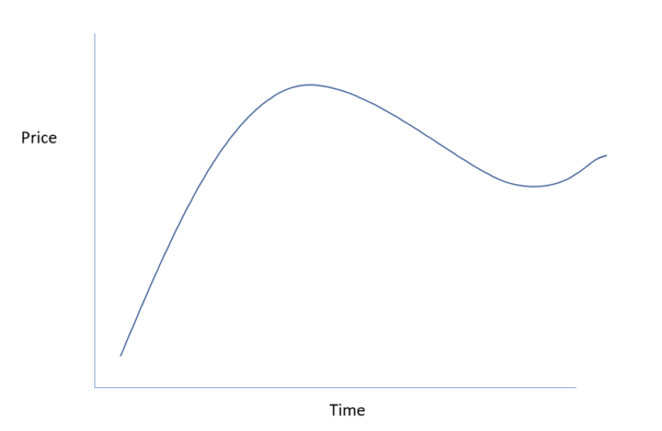
In the chart above, we can pick out a general trend in the price action over the lifetime of the chart, the high and low prices over the timeframe, and any price change of the underlying over this period. However, we can’t extract any more information than that.
To do that, we’d need to be able to visualise how price has changed and behaved between the periods of observation or individual plots that form the line chart. To provide this level of additional insight, traders developed the bar chart.
Bar charts
The big leap forward that we see with this kind of chart is that it records the range that a price trades over during the periods under observation. The bars achieve this by displaying the high, low, open and closing prices for each period observed (as we’ve annotated below).
Because of this, we can now start to see the behaviour of price action during individual periods within our observations, as well as over the life cycle of the chart as a whole.
What candles can tell us that other charts don’t, and why they’re better
It's true that candlestick and bar charts are derived from the same basic information. It’s the way that this information is displayed differentiates the two styles.
Thanks to their configuration, candle charts contain more visual information than bar charts.
The basic building block of the candlestick chart is the candles themselves. See the illustration below:
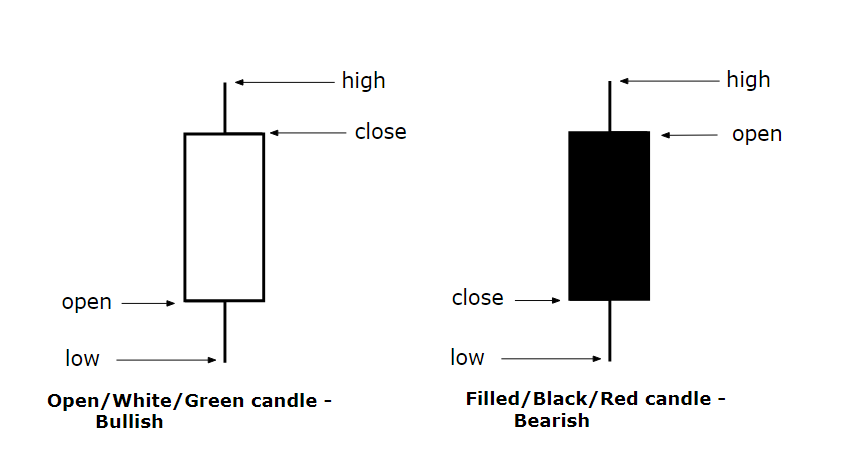
Bullish and bearish candles
The illustration above shows you where the names come from. Indeed the extensions from the candles, which signify the high and low price points, are known as wicks.
The use of open and filled candles (or colour coding) to signal bullish or bearish price action is a major plus point for candlesticks over bar charts. It makes them far easier to use and interpret, too. The shapes of the individual candles, which are rarely as symmetrical as the examples above, can also provide meaningful data to traders.
Strange names, full of information
These candles, and the patterns they form, can tell traders a lot about the psychology of the market — that is, the balance between supply and demand, or greed and fear, if you prefer.
Let’s look at some examples to illustrate what we mean here.
The shooting star
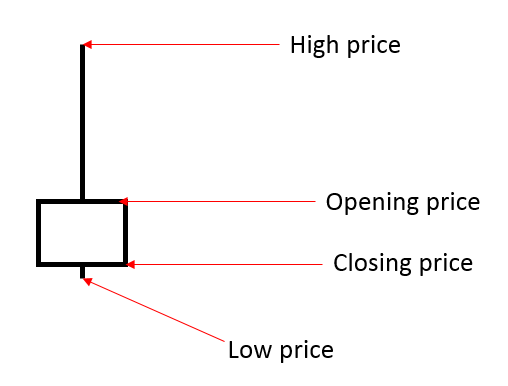
The shooting star is characterised by its long wick (tail), or upper shadow as it's formally known. Its long wick is combined with a small real body — the rectangular portion of the candle — to form the distinctive shooting-star shape.
The candle pattern typically appears in an uptrend and can signal a potential end to, or a reversal in, that trend. That's because the price has rejected a move higher and then moves back towards the opening price before closing at or close to the period-low.
This tells us that buyers, who initially “bid up” the price to the period-high, ran into sellers at that point. Those sellers’ supply outweighed the limited demand at the high. That selling pressure continued, and the price therefore retreated. Moreover, the same sellers remained active until the close of the period under observation.
The hammer
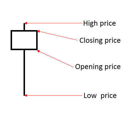
The hammer could be considered the opposite candle to the shooting star.
It usually appears in the midst of downtrend and can signal an end to, or a reversal in that trend. In this case, the price is likely to have previously been moving lower within a downtrend and continues to do so in the next period.
However, buyers quickly appear and outmuscle the sellers. The price then begins to rise, and may even make a new high on the day, as shown in this example by the small upper shadow.
We then see a close near the high and well away from the low, which was posted earlier in the period.
Look out for confirmation
It's important to note that both the hammer and shooting star will often require confirmation, either from an indicator or a subsequent candle. For example, after the posting of a shooting star, if the price subsequently gaps lower at the open or posts lower lows, then that can confirm the trend reversal.
Equally, divergence in the MACD and / or Stochastic indicators, or a pullback from overbought readings in these or RSI 14, could well confirm such a reversal signal.
Other patterns
Candlestick charts are all about pattern recognition and interpretation. As such, it takes a while to master their use.
In the examples above, we looked at two common reversal patterns signified by one candle. But many candlestick patterns consist of more than one candle or are defined by the interaction between multiple candles.
One such pattern is the “outside day” or “bullish / bearish” engulfing pattern.
Engulfing patterns occur when a short, indecisive candle is engulfed or surrounded by a subsequent larger and more demonstrative candle, which can be either bullish or bearish. This candle overwhelms the prior candle and asserts a new trend or direction in the underlying instrument.
In the image below, we can see an example of a bearish engulfing pattern.
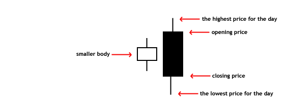
The bearish engulfing pattern typically appears in an existing uptrend that’s running out of steam or looking for fresh impetus. This explains the appearance of the indecisive white candle, which is known as a spinning top.
The bearish engulfing candle posts a new high, a new low, and crucially, a close below both the close and the low seen in the prior candle.
The concept of the sellers, or bears, controlling the price into the close is a key part of this formation. In demonstrating this, the candle tells us that supply is asserting itself over demand. That means that sellers replace buyers as the dominant force; the bulls have used up their ammunition and are no longer in control of the price.
To be absolutely certain, we’d still look for confirmation of this signal from within the price action. However, it's not uncommon to see the price gap lower at the open of the subsequent candle, when a “textbook” bearish engulfing pattern is posted.
The bullish engulfing pattern typically occurs in a downtrend. Once again, the trend is likely to be losing momentum and searching for fresh impetus. Reversal patterns such as this highlight potential inflexion points between supply and demand, i.e., buyers and sellers.
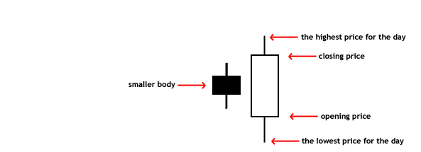
In the bullish engulfing pattern we see an indecisive candle — in this case, the short-filled candle on the left is surrounded by the larger, demonstrative candle on the right. The bullish reversal candle posts a lower open, a lower low, and a higher high than seen in the previous candle.
Crucially, the closing price is towards the high of the day, and is higher than the prior period-high. Once again we’d look for confirmation of the signal from subsequent price action.
The bullish engulfing pattern is warning us of a change in the power balance between buyers and sellers. In this case, the sellers or bears are spent, and the buyers or bulls have signalled their clear intention to take control of the price.
The next steps to take
Trading is often about doing some groundwork or, in this case, homework. That means getting to know and recognise common candlestick patterns, as well as the market psychology behind them.
To do this, you’ll need to do some study by comparing cheat-sheet candle patterns with those on your trading platform. Arm yourself with a good book on the subject that you can return to time and time again as a reference and refresher.
You don't have to master all candle patterns at once, of course. It’s highly recommended that you get familiar with three or four simple patterns and, when you are confident with those, move on to something more complex.
This is a case of practice-makes-perfect: becoming adept at recognising and interpreting candle patterns before trading them.
To begin with, you can do this on our demo account. Or, if you’re trading in the live environment, why not start with small trade sizes and sensible stop-losses? As your confidence and ability grow, you can scale up to your regular trade size.
You’ll find that it's worth making the effort to understand candle charts, which should, after all, help to make you a better trader.